Zain · oodi
A redesign concept for Zain’s digital-first telecom brand: plan, perks and rewards in one calm, bilingual app.
- Client
- Zain · oodi
- Sector
- Telecom
- Market
- Iraq
- Platform
- iOS · Android
- Role
- UX, UI, design system
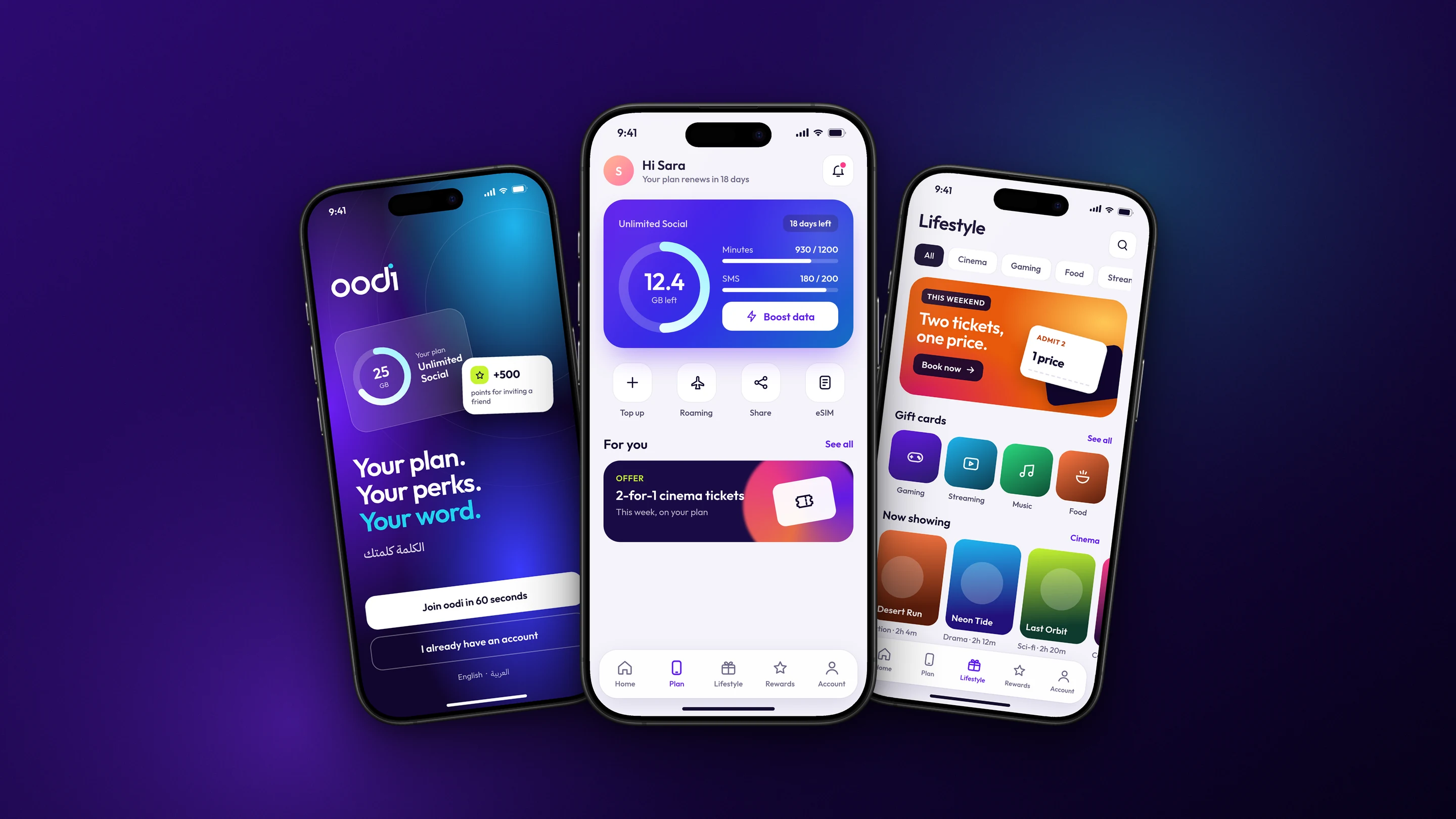
What was in the way.
oodi is Zain’s digital-only mobile brand for a young audience. With no shops to lean on, the app is the whole relationship: joining, managing a plan and discovering perks.
The shipped app packed offers, usage and account tools onto every screen. We asked what it would look like if the app felt as simple as the brand promise.
How we solved it.
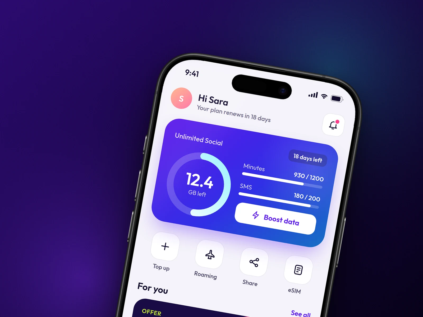
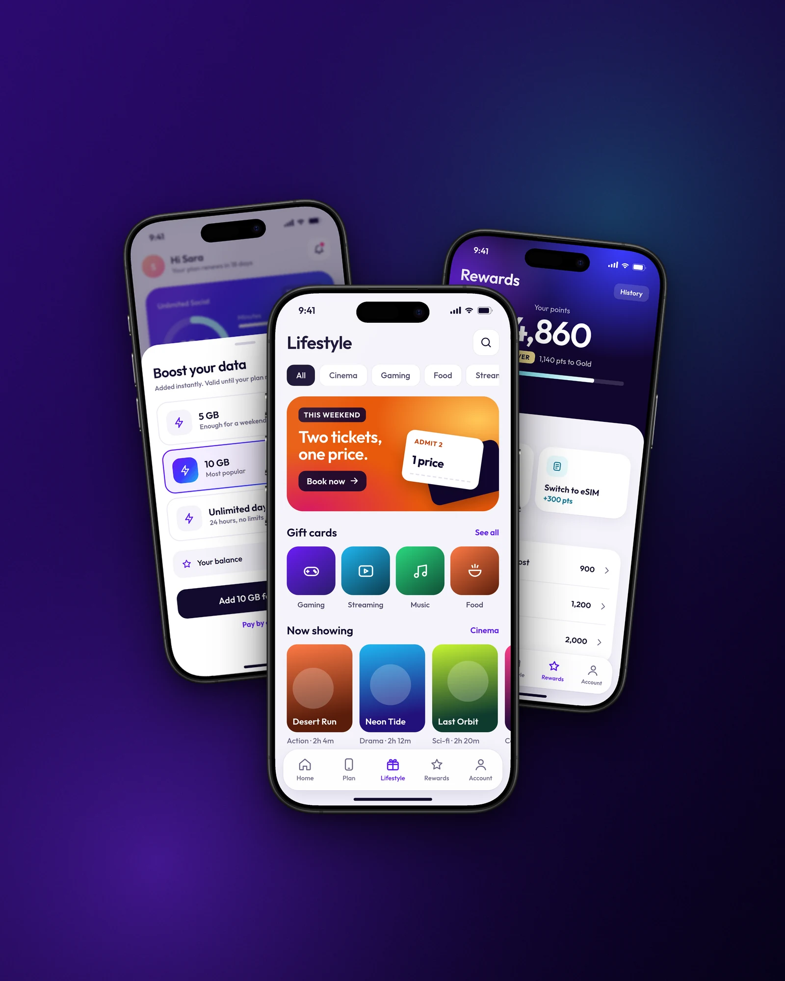
One hero per screen. Home leads with a single plan card: data as a ring, minutes and SMS as bars, and one Boost action. Offers sit below, never on top.
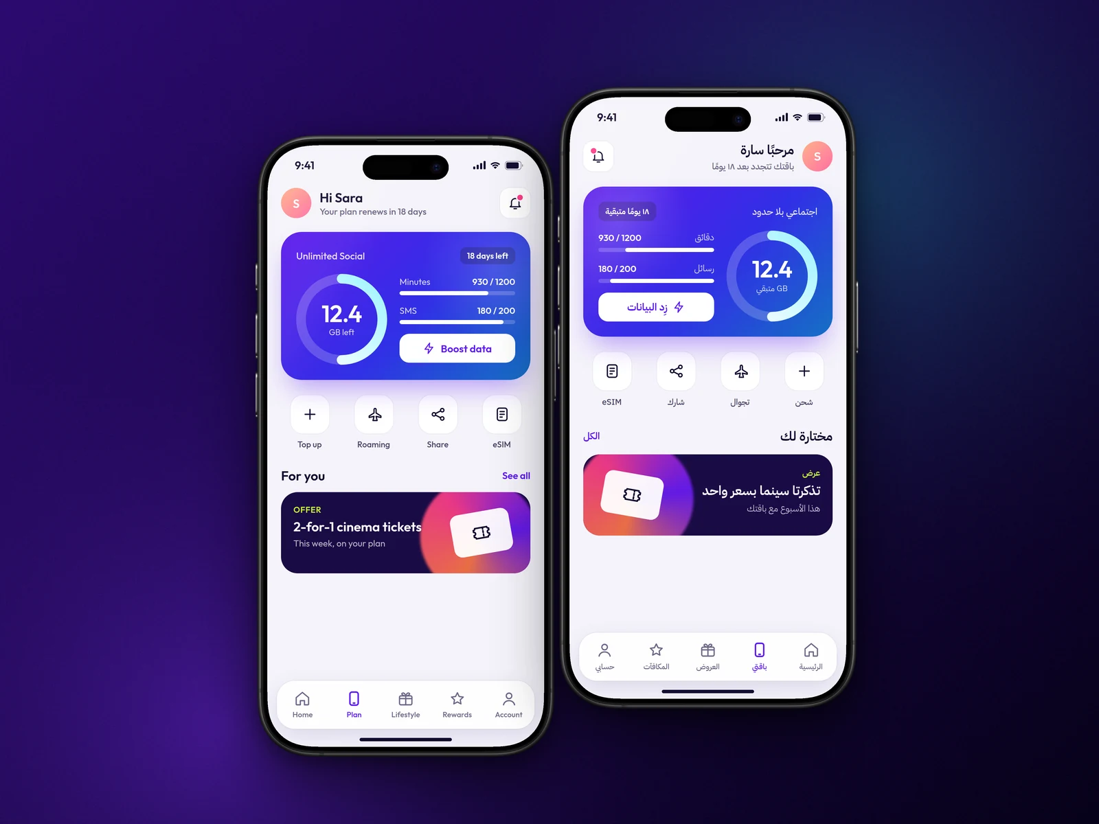
Joining takes one decision, eSIM or delivered SIM. Boosts can be paid with points, which turns the rewards programme into something people use every week. Every screen is designed in Arabic and English.
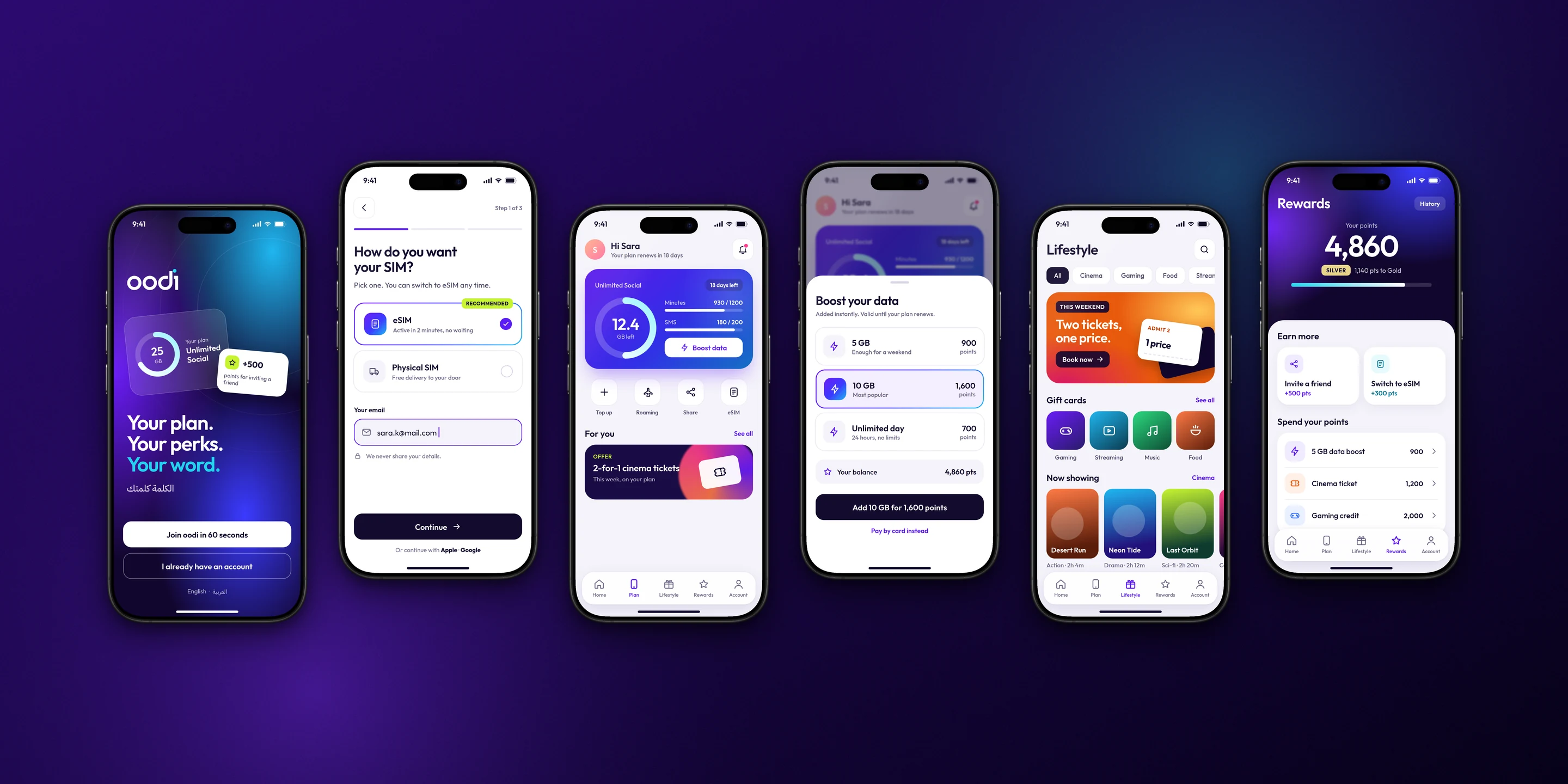
screens redesigned, from welcome to rewards
languages, with a mirrored Arabic layout
design language across plan, perks and rewards
- 01
Welcome
The brand promise, the plan and a reward, before any form.
- 02
Join
One choice: eSIM in two minutes or a delivered SIM.
- 03
Home
One plan card: data, minutes, SMS and Boost.
- 04
Rewards
Earn points, then spend them on data, cinema and gaming.
Our role
- Product thinking and information architecture
- UI design and design language
- Arabic and English layouts
- Interactive prototype
About this case study
- A Qartas redesign concept, built on our original product work for oodi.
- The screens here are a new design by Qartas, not the version in the app stores.
- Shown with the client’s permission.
Planning a digital product? Let’s discuss the brief.
Discuss your project