Naha
A bilingual identity for a Dubai maker of luxury Arabic sweets, written in Arabic first.
- Client
- Naha
- Sector
- Food · Hospitality
- Market
- UAE
- Applications
- Packaging · Retail
- Role
- Brand identity, packaging
What was in the way.
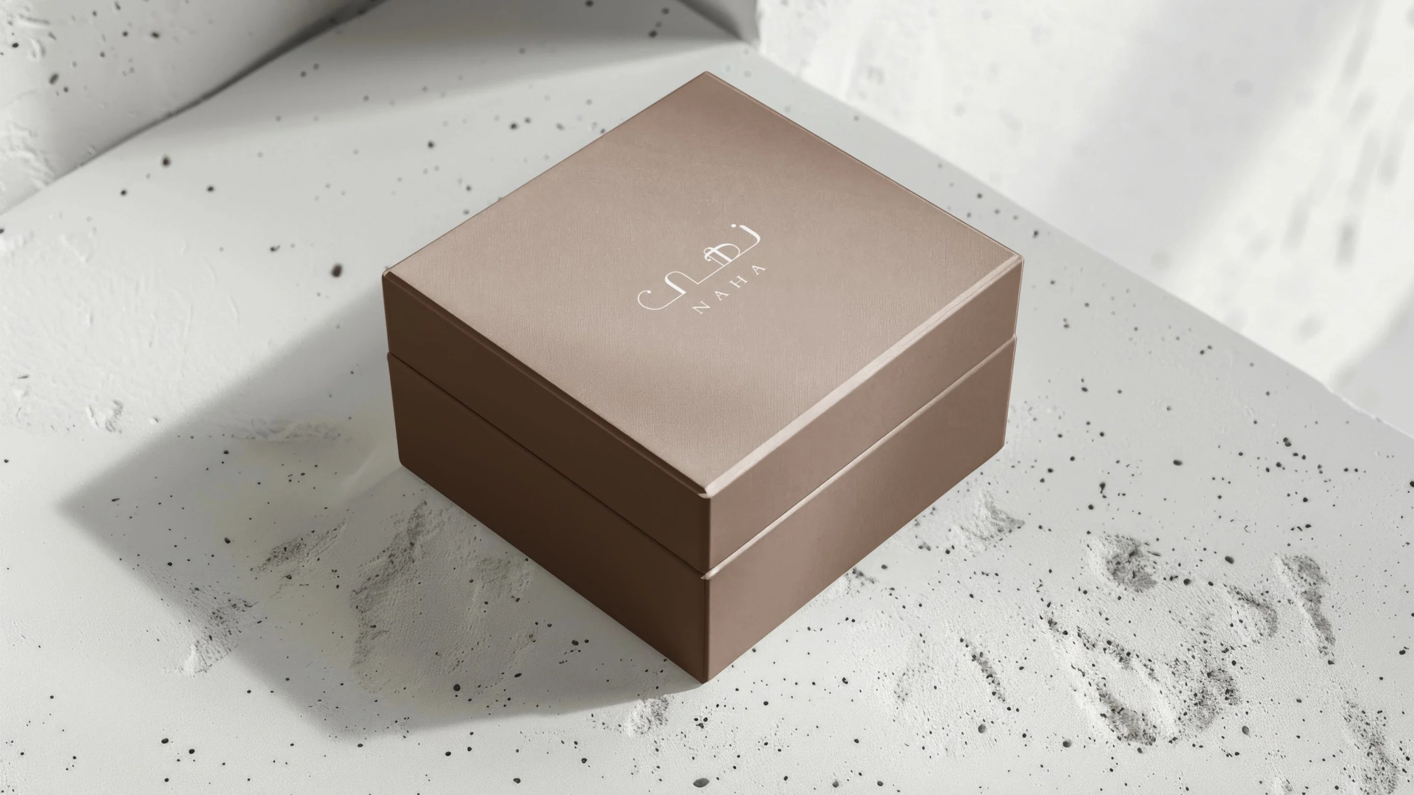
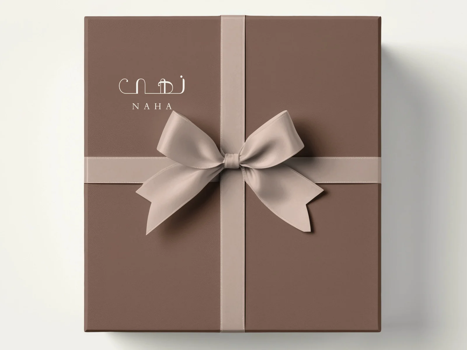
Naha makes luxury Arabic sweets in Dubai. In the Gulf, sweets are a gift: they arrive at weddings, Eid visits and business meetings, so the box often speaks for the brand before anyone tastes what is inside.
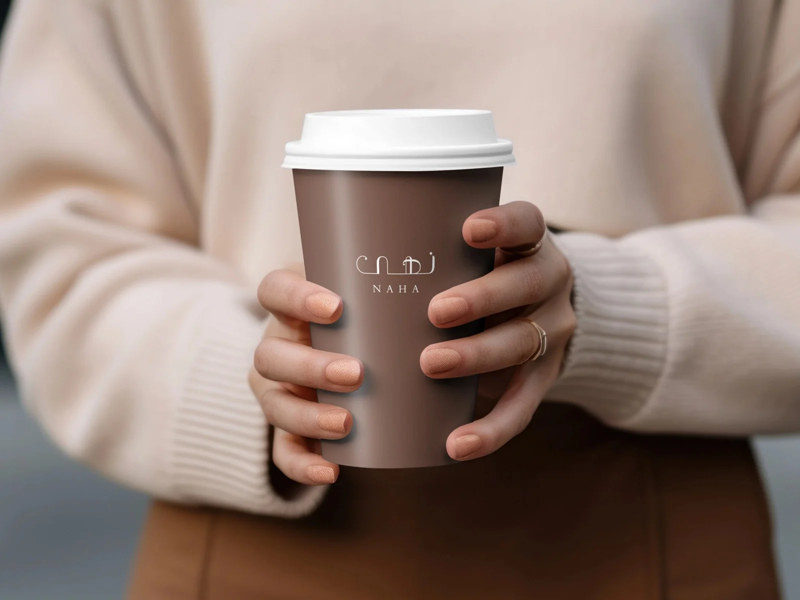
The identity needed to feel premium without leaning on gold and ornament, and to work in Arabic and English on everything from a ribbon to a shopfront.
How we solved it.
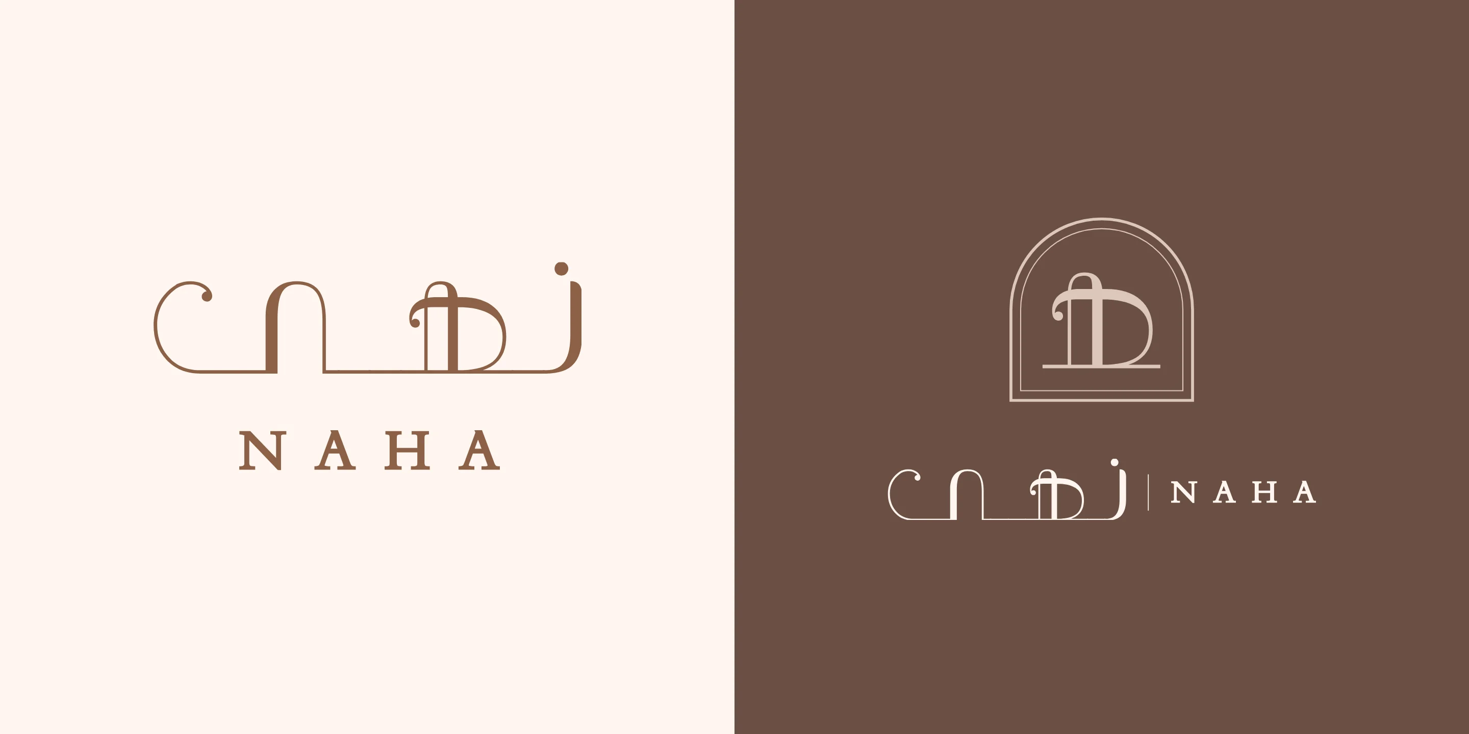
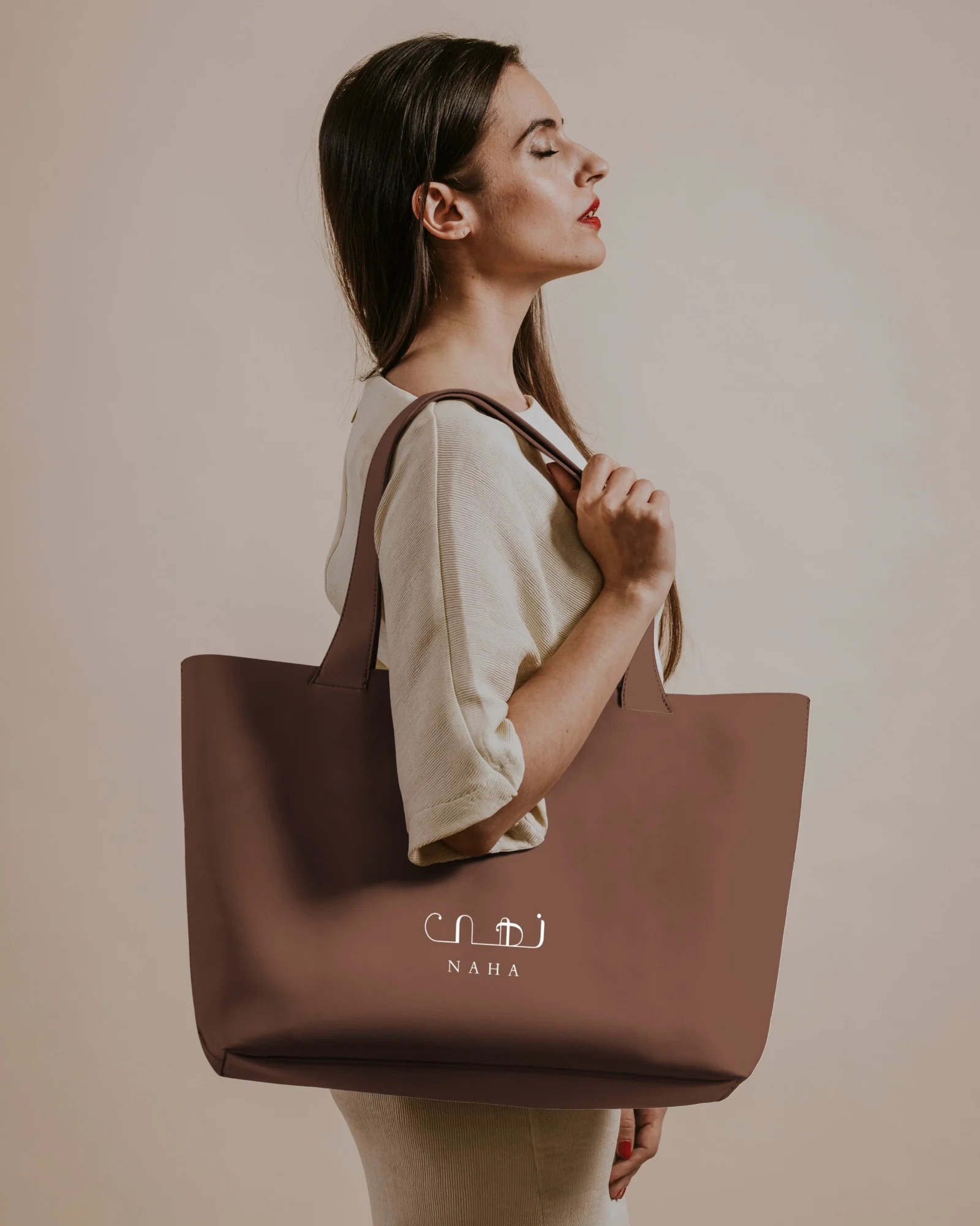
We drew the name in Arabic first. Arched letterforms stand on one unbroken baseline, like the doorways of an old souq, and thick and hairline strokes follow a calligrapher’s pen. NAHA in spaced serif capitals sits beneath as the English voice.
Colour stays in the warm browns of roasted nuts and dates, with Copper kept for foil and ribbon. A seal cut from the letter heh closes boxes and marks stickers, where the full wordmark would be too small.
touchpoints, from gift boxes to the shopfront
logo lockups, including a new seal
scripts, Arabic and English, set together
- 01
Wordmark
Arabic first, drawn as arches on one continuous baseline.
- 02
Seal
The letter heh inside an arch, for stickers, wax and ribbon.
- 03
Colour
Six warm colours; Cocoa for packaging, Copper only as foil.
- 04
Type
Cormorant Garamond and Amiri, with Jost for small print.
Our role
- Brand identity in Arabic and English
- Colour, type and logo system
- Packaging and retail applications
- Uniform and merchandise
About this case study
- Identity designed before Qartas launched as a studio.
- The seal, the small-size logo cut and the refined palette were added by Qartas in 2026.
- Applications are shown as presentation mockups.
- Shown with the client’s permission.
Building or renewing a brand? Let’s talk.
Discuss your project